how a faceless bot got a hedgehog — and what went wrong on the way
a bot for parents — and zero marketing
in Ukraine i ran a project that tells the stories of entrepreneurs: The Business Code. Vitaly, an entrepreneur from Canada, saw those videos — that’s how we met. his product: ADHD Parents AI, a voice-first telegram bot for parents of kids with ADHD. in a hard moment, parents send a voice note and get a calm, concrete plan back — what is happening right now, what to say to the child, how to bring the tension down. the bot was running. what was missing was everything else: audience, channels, a face, a tone.
i started with strategy, not with a logo. the first decision was the hardest: app store or Telegram? an app store means weeks until approval and a gatekeeper in front of every change. in Telegram you change the product in hours — and that’s where the ukrainian- and russian-speaking diaspora is, the one all the competitors with their english apps don’t reach. so Telegram only. no app. and a parent of a kid with ADHD isn’t looking for a diagnosis, but for help at 7 pm.
the first list was wrong — and a hundred groups aren’t a hundred doors
the first contact list targeted adults with ADHD — logical, but wrong: the product is for parents. so everything was re-sorted, parent groups to the top, two audiences: ukrainian- and russian-speaking parents in the diaspora, and english-speaking ADHD communities. that became a base of 287 verified contacts — parent groups, child psychologists, bloggers, organisations — every link checked by hand, and 83 personally written messages for the first wave.
for the english market came a plan with 100 groups: 43 for parents, 42 for adults, 15 general — Facebook, Reddit, Discord, forums. and here came the first wall: in the first week we reached eight groups, not a hundred. the rest needed accounts, history and access that a new account doesn’t have. two decisions: the message switched to “feedback first” — say honestly that the product is in a free test, ask for feedback instead of money, no price in the first message, not a word about referral rewards, because that is exactly what every community reads as advertising. and the follow-up went to a helper with her own accounts — with one simple document instead of the two pretty overviews i had built first. “just paste the message, nothing more.”
mid-wave: the product needs a face
while writing the messages, something became visible: a bot without a face is just a link. parents who are at the end of their rope in the evening don’t open a link — they open something they trust. the idea came during the wave, not before it: a mascot that gives the product a name, a tone and a body.
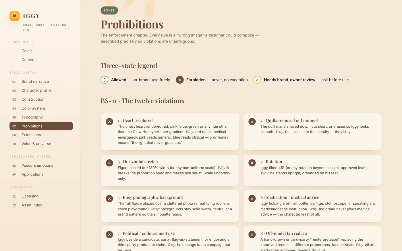
before drawing anything, i studied how the best do it: the design manuals of japanese city mascots, korean character guidelines, the brandbooks of american corporate and college mascots — 29 manuals, about 600 pages. what we took: the three-state legend ○ / ✗ / △ for allowed, forbidden, check · a numbered asset catalogue · clear rules on who may change the character and how. what we didn’t take: a style. that had to be our own.
✓ three-state legend ○ / ✗ / △ — from the japanese manuals
✓ numbered asset catalogue — from the korean guidelines
✓ licensing and change rules — from the corporate brandbooks
✗ other people’s styles, other people’s characters — none of it goes into the book
three characters, six styles, sixteen concepts — one stayed
i split the decision into two axes: who the character is, and how it is made. three candidates: Dopa, an axolotl that regenerates and never grows up · Rook, a raccoon, the chaos buddy from ADHD meme culture · Momo, a living spark. plus six styles, from needle-felted plush to vector. 16 concepts in one day, generated with AI.
and then my own sentence, which took care of half of them: the product is for parents, not for kids. the axolotl stood too close to the toy shelf. the raccoon’s mask read as a thief — and even without the mask the suspicion stayed. the spark stayed abstract; you can’t hug it. from the sixteenth concept one line was left: a hedgehog with a light in its belly. prickly outside, a light inside. that was it.
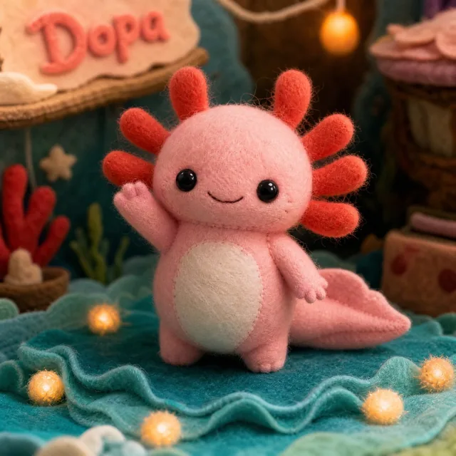



“prickly outside. golden inside.”
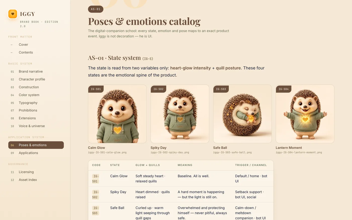
Iggy. a hedgehog whose spikes rise on a “spiky day” and settle again in the evening — and a golden heart that glows in every state. the anatomy is the product: the spikes are the bot’s states, the heart is the thing that never goes out. the brand’s vocabulary came with it: spiky day, glow, tiny step.
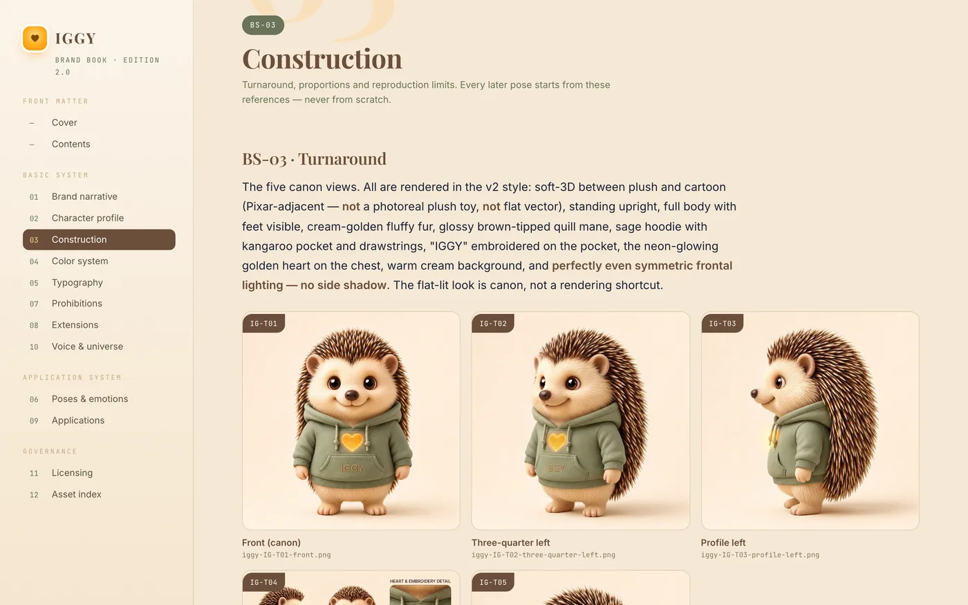
the style took three attempts — and each had a reason to fail. version one: matte clay 3D with lilac spikes, coherent but cold; a whole book had already been built on it, 35 renders, all discarded. version two: realistic plush after a reference from the partner — warm, but a toy; plus a side shadow that wouldn’t go away and two eyes that never shone the same. the third one i generated myself as a reference image, and it clicked at once: soft 3D between plush and cartoon, a sage-green hoodie, a glowing heart. that became the canon — every further pose is made from exactly this image.

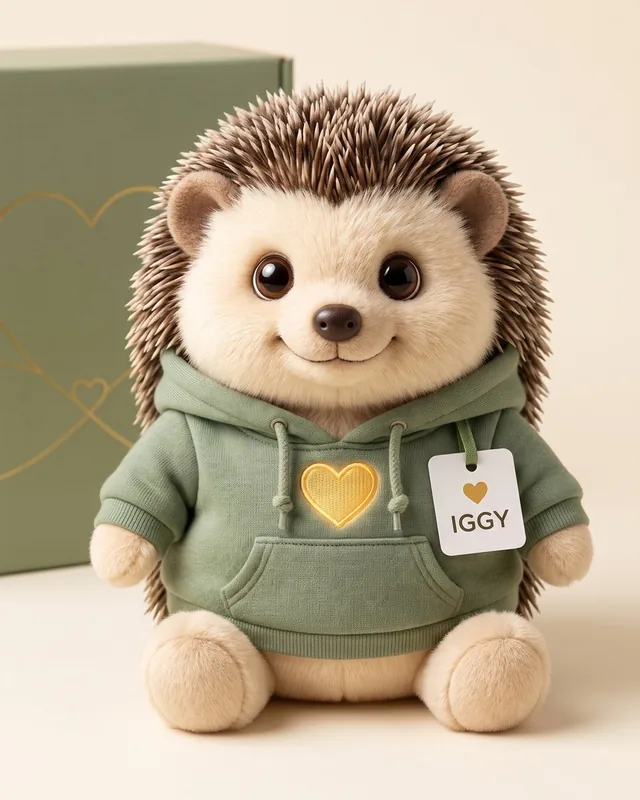

before, a logo. after, a character who explains the product himself
this is what the product looked like before we started: a blue circle saying “ADHD AI” — correct, factual, and no reason for anyone to open the bot. a tool without a face that promises a parent nothing at 7 pm.
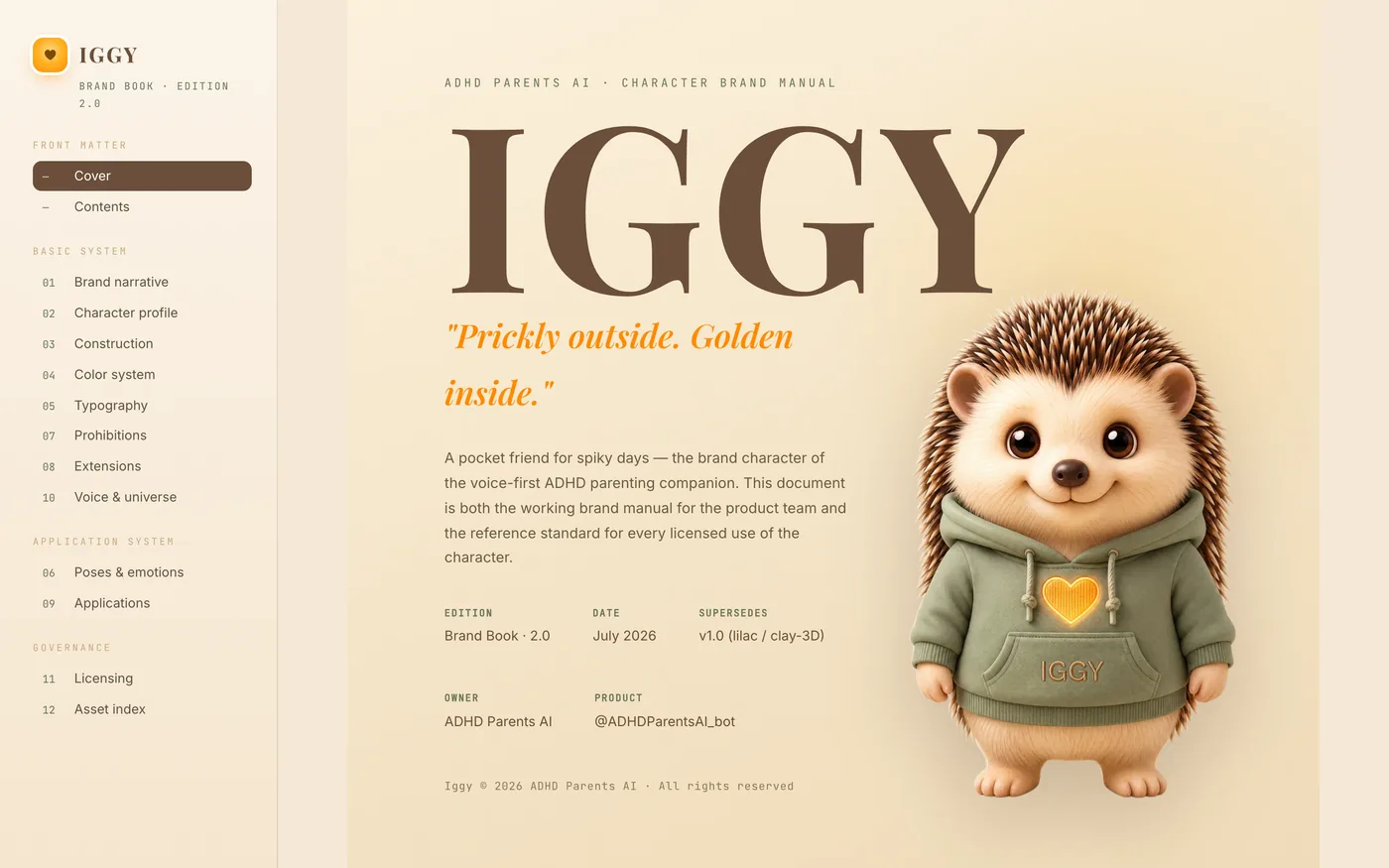
after, Iggy explains the product himself — in two films: one for professionals who work with families, one for parents at home. the same function as before, but now with a face, a voice and a story.
a book that protects the character — the second edition
a mascot without rules falls apart after the third freelancer. so a brandbook, built like the big ones: 12 chapters — origin, profile, construction with turnaround and safe zone, colour system, typography, pose and emotion catalogue, 12 prohibitions with ○ / ✗ / △, extensions, applications, voice, licensing, asset index. 31 renders from one reference image: five views, eight emotions, ten poses for the bot’s events, four states, four applications. every render has a code, and the code lives in the book, in the sticker list and in the handover to the developers.
the first edition of the book failed — rightly so. a golden glow lay over every image and made the renders look soft and cheap. the mistake wasn’t in the images but in the layout: an effect laid over the pictures. two hours later the second edition stood, without the glow, with a cut-out title figure. the lesson has been in every project of mine since: check embedded images at full size, not in the preview. and one more thing is in the book, in black and white: Iggy belongs to the product, not to me. book, telegram integration and two specs — bot and admin panel — went to the team on the same day.
stickers are distribution, not decoration
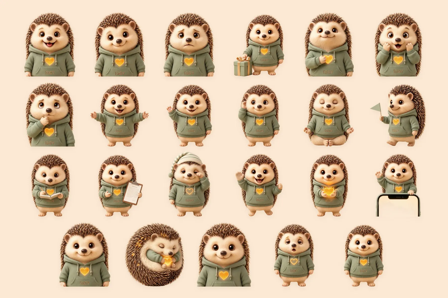
in Telegram a character isn’t looked at, it’s sent. hence a sticker pack: 23 stickers, each with its emoji — happy, calm, worried, gift, proud, surprised, thinking, hug, hello, i’m listening, breathe, tiny step, journal, report for the doctor, good night, high five, heart in paws, let me look, calm glow, safe ball, avatar, tired, and Iggy once in full. two of them had the wrong names after export — “sleepy” was actually “gift” — found by checking image by image, not from the list.
the rule behind it: you get the stickers as a gift after the first small win, not at onboarding. a gift travels on, an ad doesn’t. and the most important rule of all, written into the book: the more stressed the parents, the less character. in a crisis the bot answers with text — no image, no delay. Iggy shows up when there is air again.
sound young without being a child
Iggy was meant to speak: for a 30-second welcome video and for the world of the stickers. we designed the voice with AI — warm, quiet, with a bright, young timbre. the provider rejected the first description because it named an age; so we described the youth through the tone colour, not the age. two passes, one voice — and two long readings for the partner’s showroom, one for clinics, one for parents.
the script for the welcome film lives in the brandbook: five beats, 30 seconds, no hard cuts — parents arrive exhausted, the film has to feel like breathing out. every scene is mapped to a render. from the renders and the voice we made short videos with Iggy.
the character gets its place — five rounds in one day
finally, the partner’s website for his AI products. the fifth version came from him, with the wish for “a very strong product”. i rebuilt it in one day, in five rounds — one story from top to bottom instead of a collection of tiles. my proposal for a dark, lamp-warm palette got thrown out: the colours stayed his. also thrown out: a pricing tier that no document backed up, and every number that couldn’t be proven. no invented clients, no invented numbers.
in the middle, a big section for the characters: a line-up in which every product has its own face. Iggy stands there as the only one with the status live; the others are honestly marked “in build” or “library”. plus a chat where visitors can type or speak — and which, for questions it can’t answer, hands over to a human instead of improvising. you can scroll through the page right here; the partner’s header and prices are left out.

one hedgehog became a universe
Iggy was the first. following his pattern, we built a character of its own for every product on the platform — and each one got its own brandbook. Corvus, the raven, does the economics. Lucky, the golden retriever, shows how it feels for the users. and every industry has its own face: the cat for veterinary care, the red panda for nutrition, the bear for immigration, the beaver for rehab, the meerkat for a fresh start.

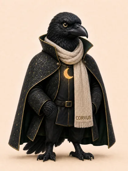



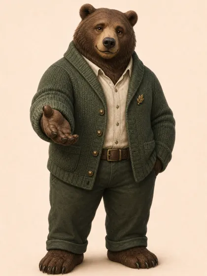


later, all these products became part of MESA, the partner’s platform — and the characters turned into our way of working: one face, one film and one brandbook per industry, using the same method as with Iggy.
the bot turned into a platform
the project set off something bigger. the same partnership, the same logic — a product that lives in the user’s pocket and does nothing without their yes — became the basis for KORA, a private company AI that lives in a box on the desk. its marketing: a case of its own.
read the KORA case ↗a product for exhausted parents doesn’t win with features. it wins with a face you still believe at 7 pm — and with the discipline to leave it out exactly when things get serious.