how a name that was already taken became a brand with eyes
los angeles, zero point zero — and a category that sells promises
a friend, a steam machine, a van: that’s how sofa cleaning in los angeles begins. no name that holds, no site, no google listing. i didn’t start with a logo, i started with the market — who sells what here, how, in which colour.
stoomy is a friend’s new business. i built the brand and the site without a fee to help him get started — the deal: he recommends my work in the US.
two things were clear after the audit. los angeles isn’t one city, it’s 14 small markets side by side: in the map pack 28 companies share the neighborhoods, none holds more than three. and the whole category looks the same — grey, white, a bit of blue, with “professional” and “trusted” in every second headline. everyone sells a promise. nobody puts the proof, the same sofa before and after, up front.
so the rule for everything after: proof first, price on the page. that’s how the brand was built, that’s how the site was built.
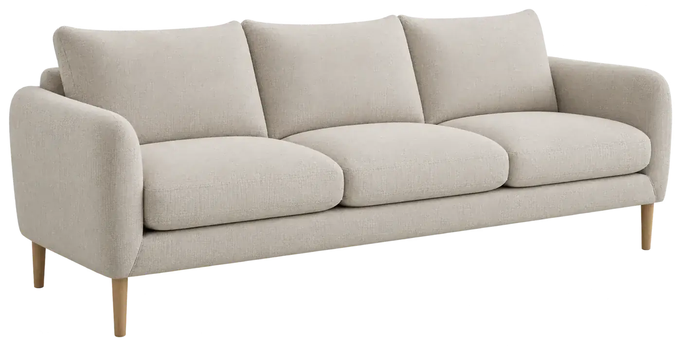
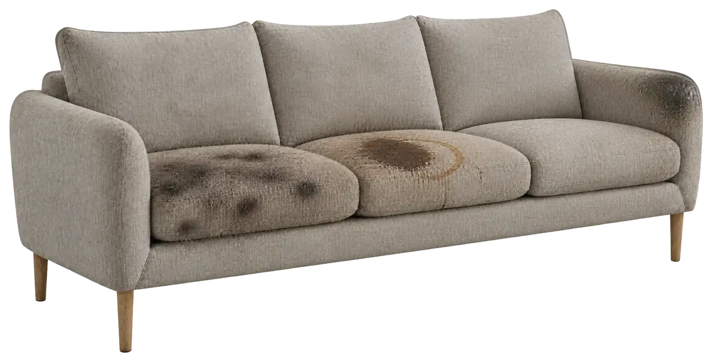 afterbefore
the first brand was called SteamWave — and the name already belonged to someone
the first brand came with the founder: the name SteamWave, plus a blue wave logo as a vector. i built on it — signature, favicon, and a first site on framer: before-and-after to drag, open prices, a real map with 22 neighborhoods from public census data, FAQ answers without a click. the site stood in a week and looked tidy.
that was exactly the problem: it looked like the category. blue, a wave, a steam photo, capital letters. and then came the message that decided everything — the name SteamWave was already taken. you don’t build a brand on someone else’s name. so once more, properly this time.
✗ the name already belonged to someone
✗ blue + wave + steam photo — half the category looks like this
✗ a builder instead of code
✓ what stayed: proof first, open prices, 22 neighborhoods, FAQ without a click

stoom is steam. stoomy is someone.
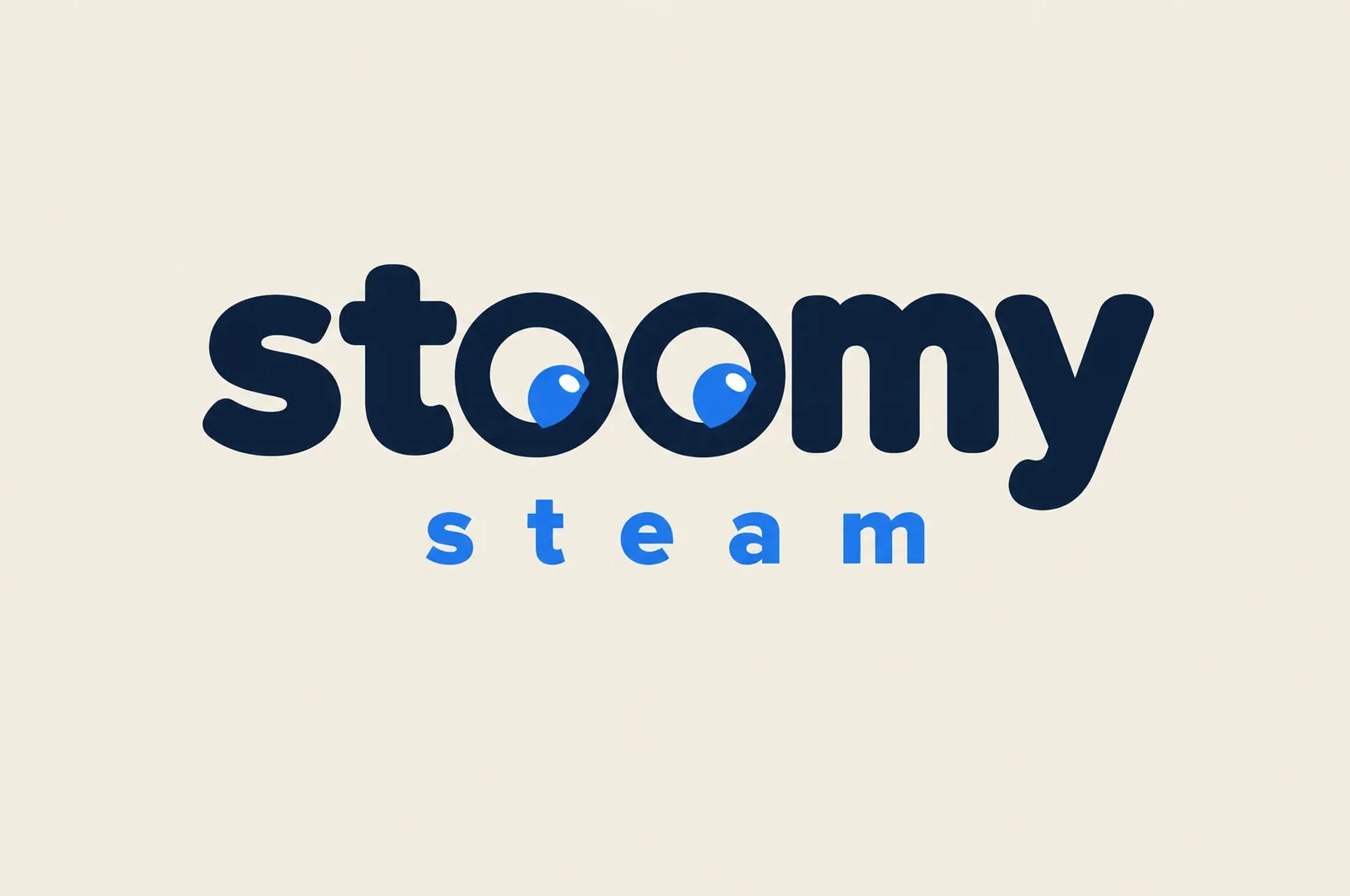
the new name had to be free, short, and sound like someone who rings your doorbell — not like a corporation. Stoomy Steam: stoom is steam, stoomy a friendly, made-up word. in everyday speech it’s just “stoomy”.
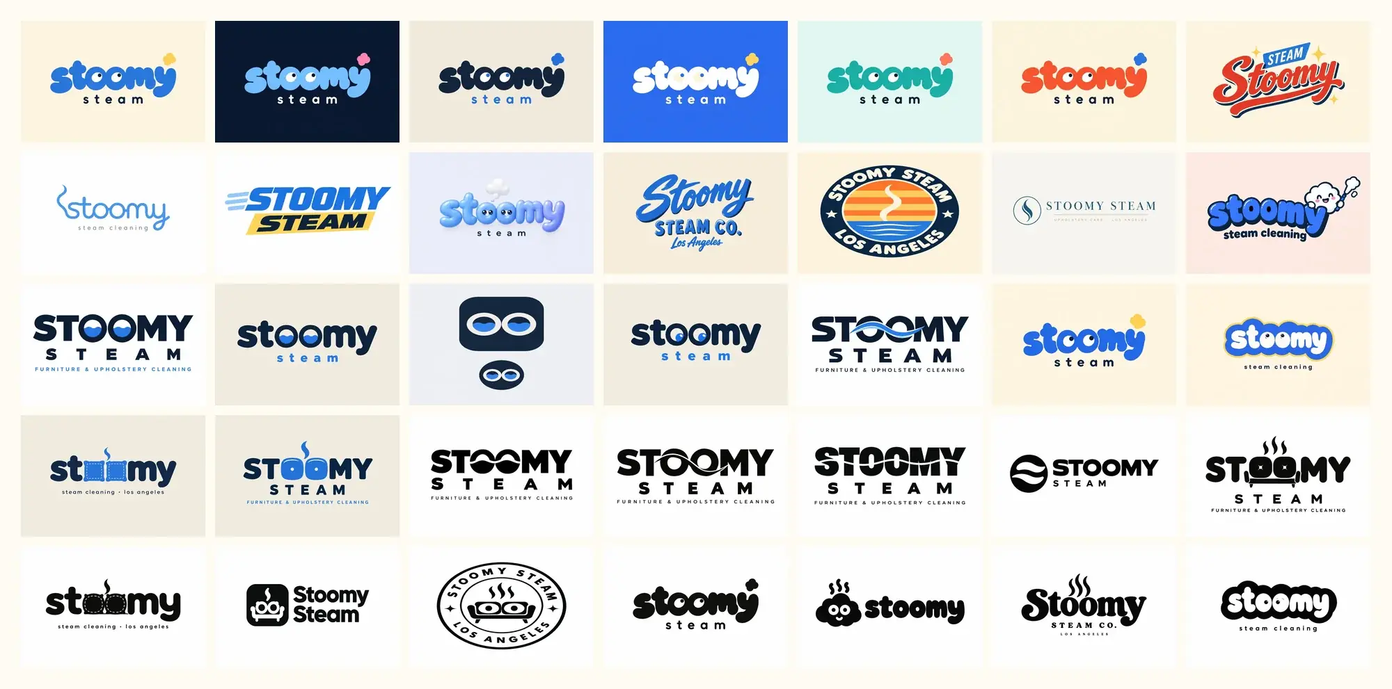
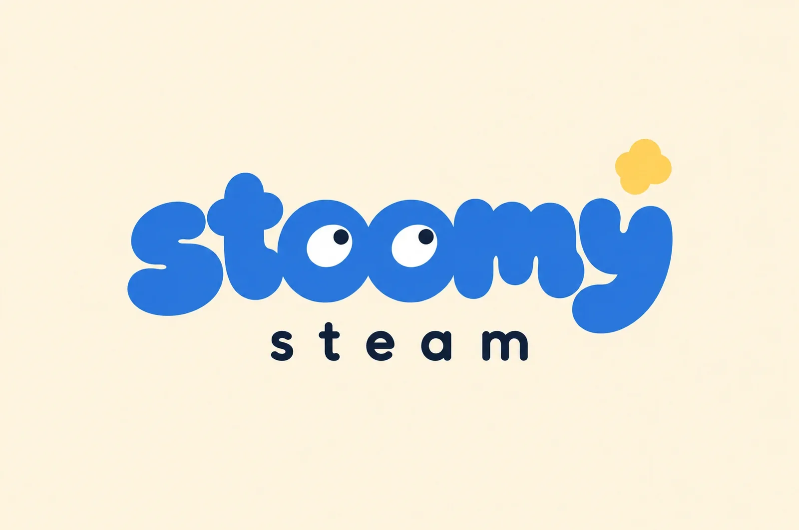
for the mark i generated 35 ideas in five rounds with AI: black-and-white form studies, then the waterline and the cushion idea, then eight styles from diner script to spa monogram, finally six colourways of the puffy version. the eyes showed up early — first as water drops in the “oo” — and refused to leave. №1 won: puffy lowercase in blue, two eyes, a butter-yellow steam puff above the y. from the winner i rebuilt a clean vector by hand — shapes retraced, eyes redrawn, colours measured. the AI origin is written into the brandbook, job ids included.
the logo is the character
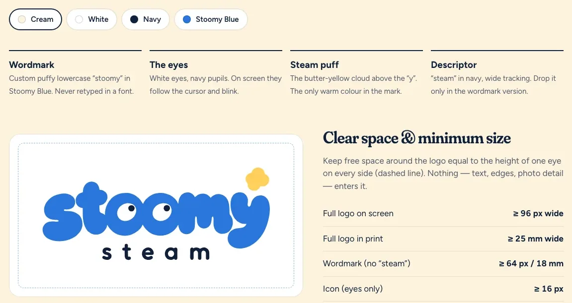
there is no mascot next to it. the wordmark itself is stoomy. the puffy letters feel like cushions and clouds of steam; the two eyes in the “oo” turn a word into someone. white eyes, navy pupils, always. the butter-yellow puff above the y is the only warm colour in the mark — one, no more. “steam” below in navy, wide tracking, is dropped only when the word already stands nearby.
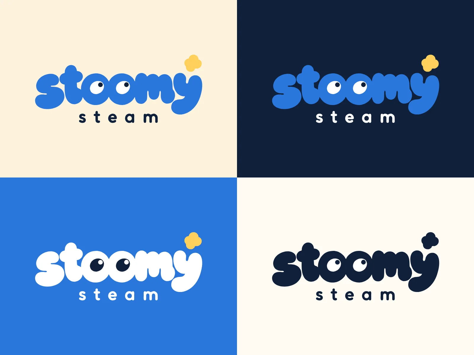
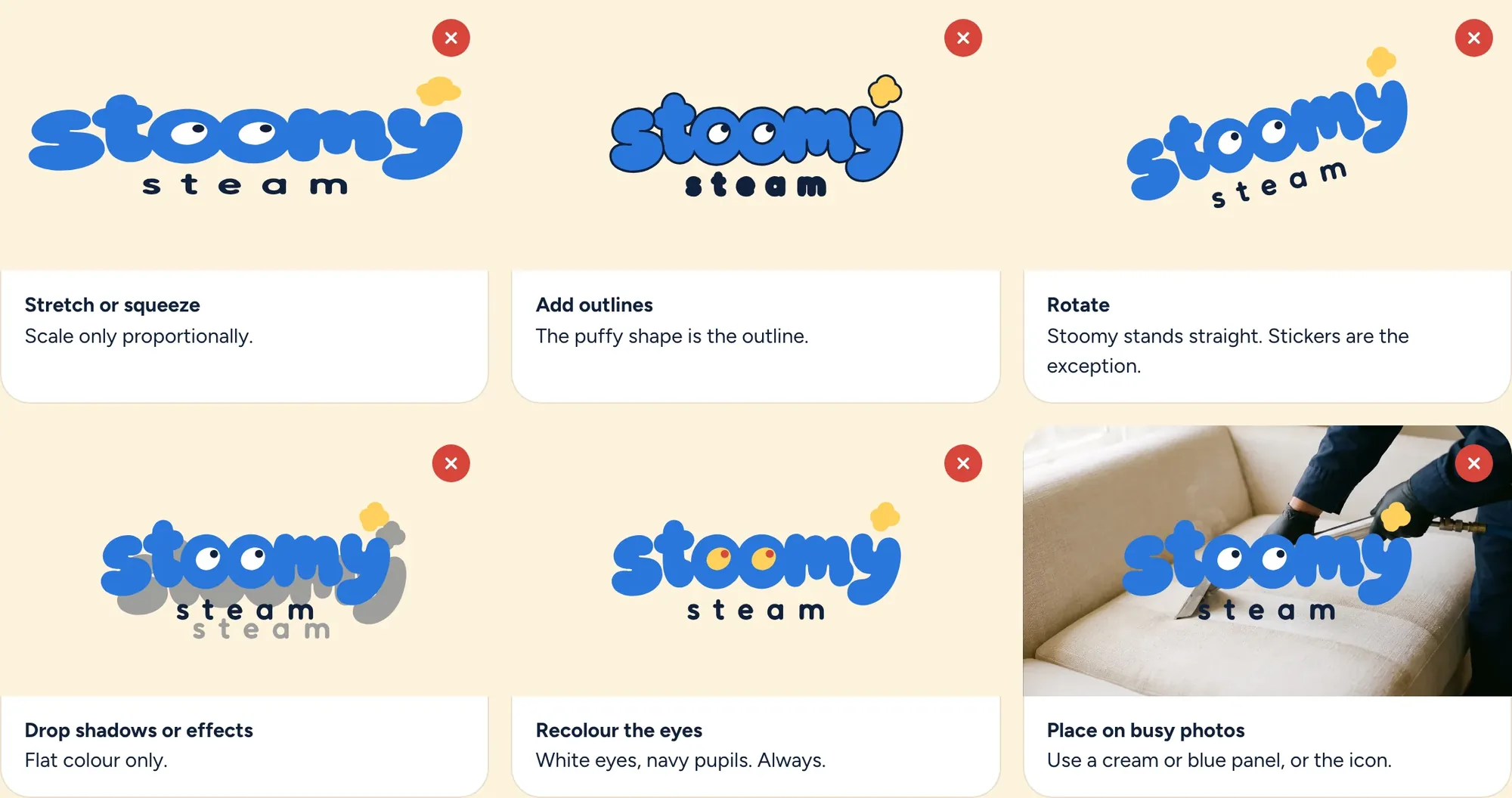
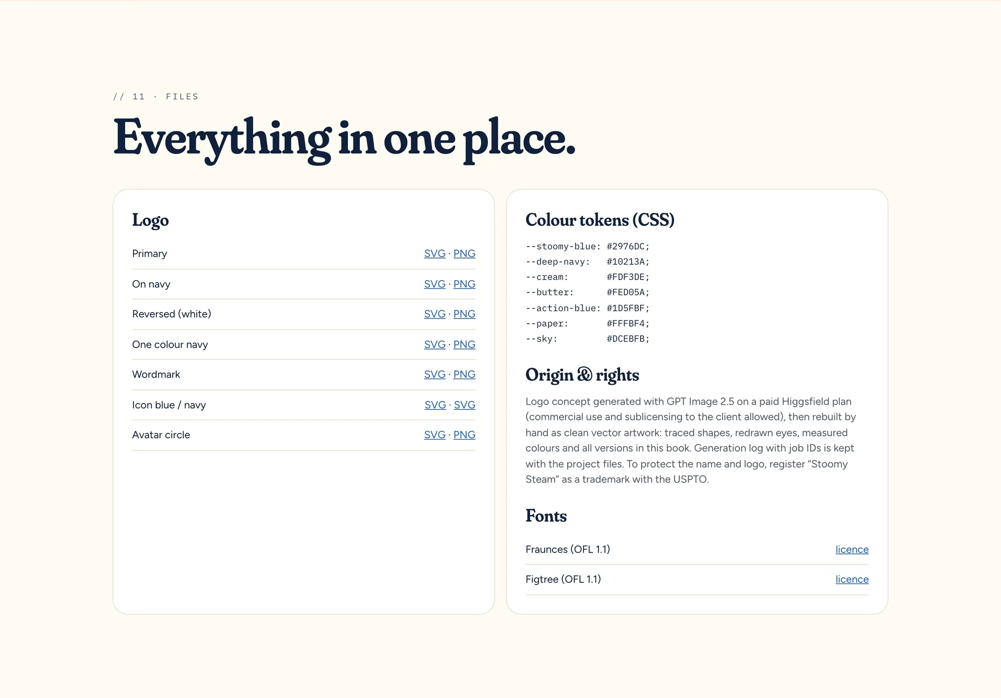
the rules are short and strict, so the mark is still the same after the third contractor: clear space equal to the height of one eye on every side, at least 96 pixels wide on screen and 25 millimetres on paper, eight versions from primary to avatar — and six don’ts. the most important one: the eyes are never recoloured. a character with yellow eyes is a different character.
✓ wordmark — puffy lowercase, never typed from a font
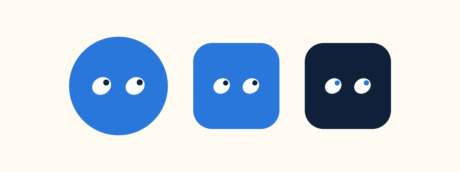
✓ the eyes — white, navy pupils; on screen they follow the cursor and blink
✓ steam puff — butter, the only warm colour
✓ “steam” — navy, wide tracking
eleven chapters, so the brand works without me
a brandbook isn’t a PDF for the drawer, it’s the manual for the next printer, the next freelancer, the next van wrapper. so it’s built as a web page, eleven chapters: click a colour and the hex is copied, every logo sits there as svg and png to download, the type can be clicked and typed into.
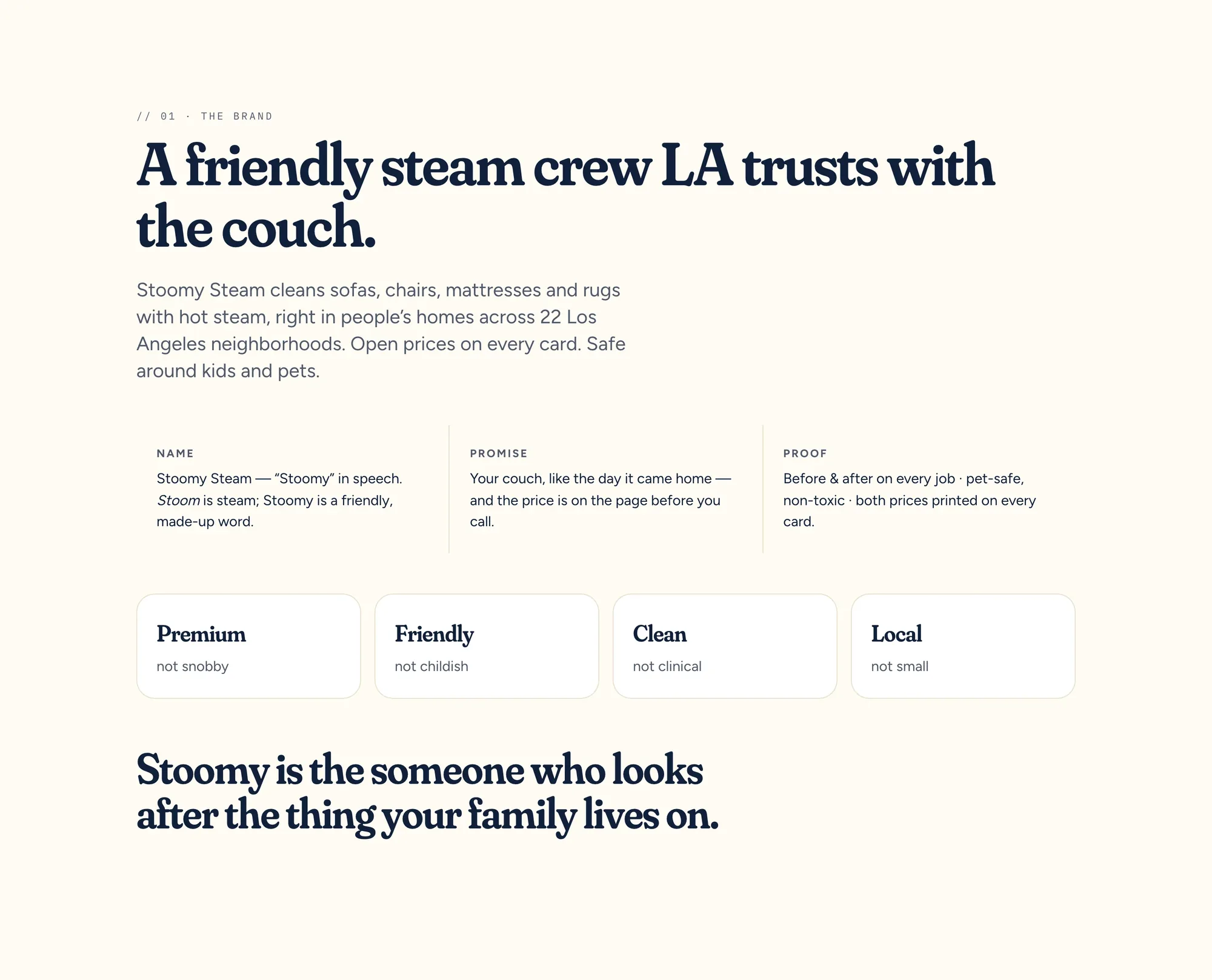
01 brand. one sentence that carries everything: “a friendly steam crew LA trusts with the couch.” below it four pairs that pin the tone — premium, not snobby. friendly, not childish. clean, not clinical. local, not small. and the promise: your couch like the day it came home — and the price is on the page before you call.
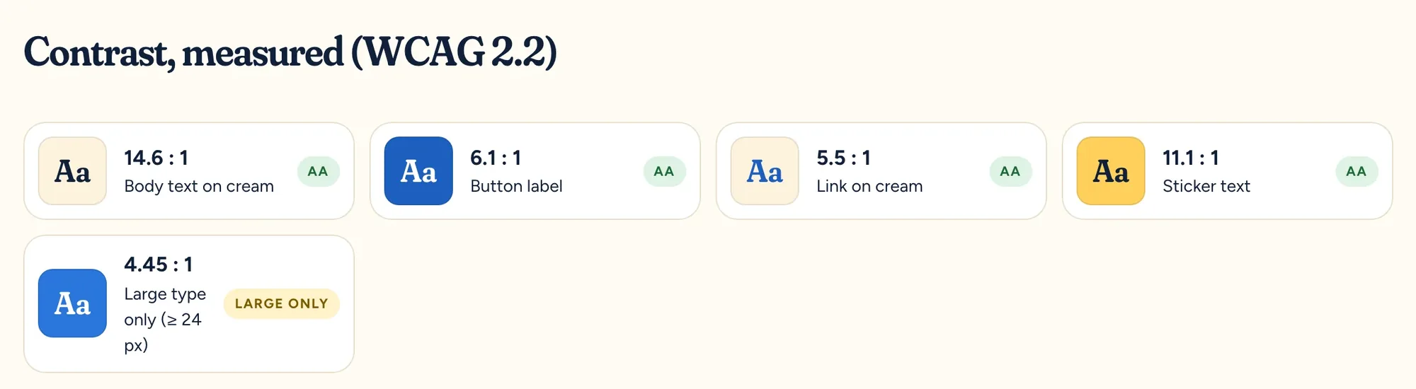
03 colour. blue steam on a cream couch. four colours measured from the logo — stoomy blue, deep navy, cream, butter — plus three helpers for screens. the split is in the book: cream 55, navy 20, blue 15, butter 10. cream is the colour of a clean couch; in a grey-and-white category it’s the first thing you see. butter appears exactly once per screen. every combination is measured for contrast — text on cream sits at 14.6 : 1.
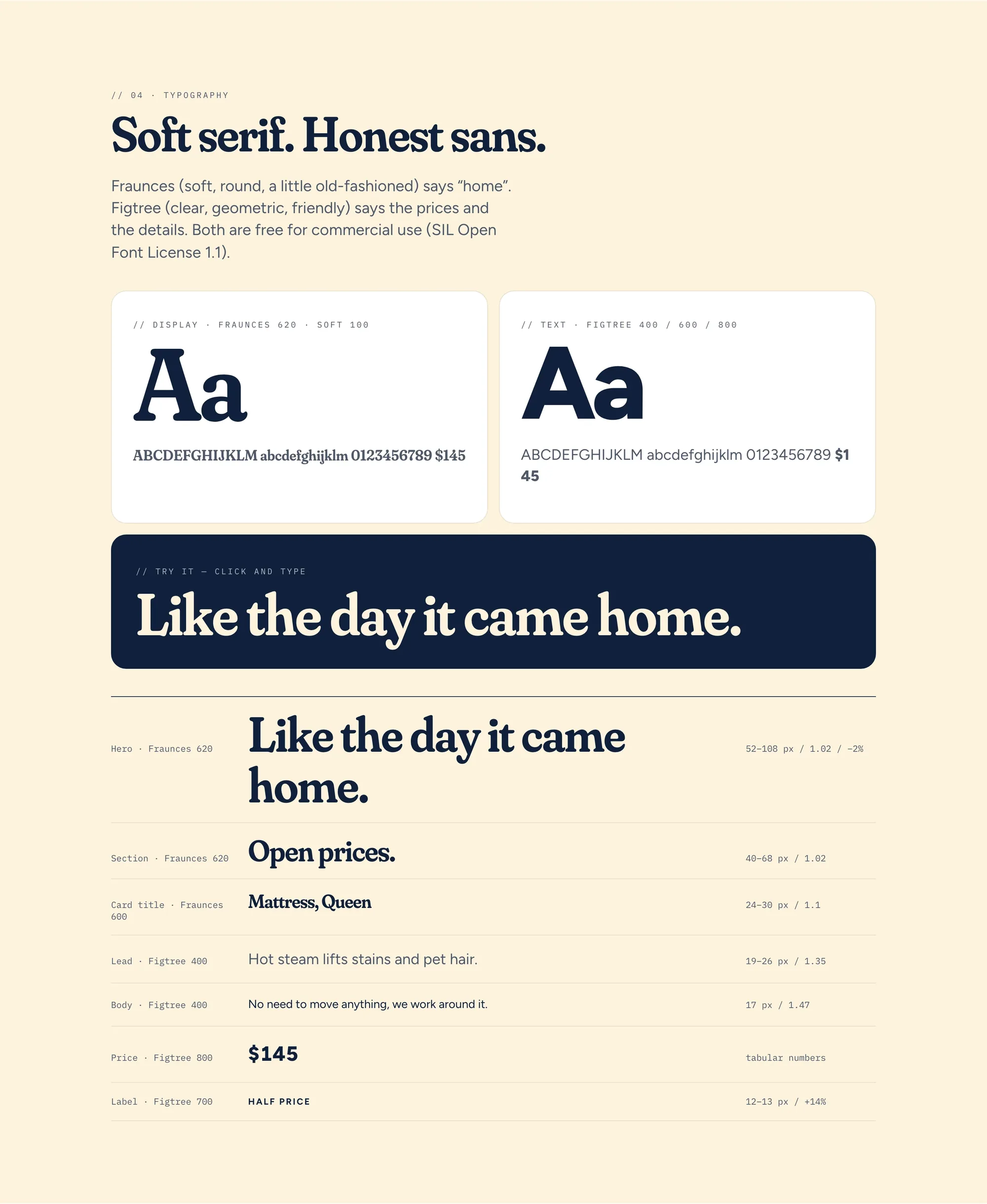
04 type. soft serif, honest sans. fraunces says “home”, figtree says the prices and the details — with tabular figures so amounts line up. both free for commercial use, no licence trap for the founder.
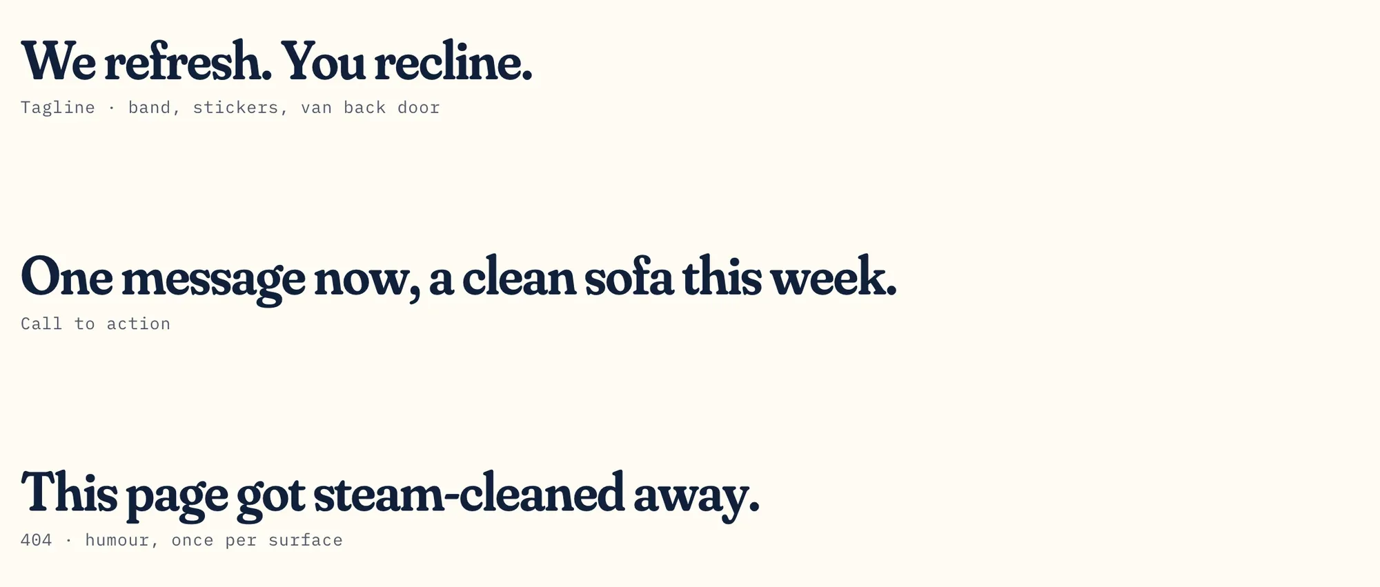
05 voice. say the number. say it kindly. stoomy talks like the person who rings your doorbell: short sentences, real numbers, no hype. the book lists what we say and what we don’t — “reviews are coming” instead of “rated #1 in los angeles”. three lines belong to the brand for good: “we refresh. you recline.” on the van and stickers, “one message now, a clean sofa this week.” as the call, “this page got steam-cleaned away.” for the 404 — humour exactly once per surface.
✓ no need to move anything, we work around it.
✓ we tell you before we start, not after.
✓ reviews are coming.
✗ ★★★★★ rated #1 in los angeles
✗ chosen by celebrities
✗ call now for a free quote!!!
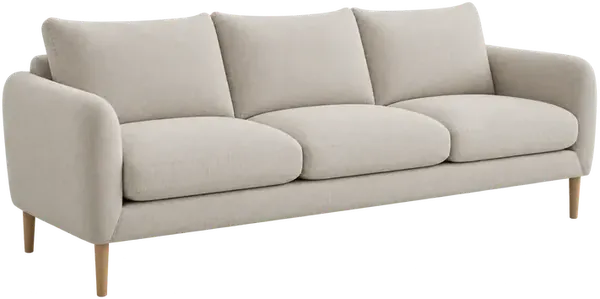
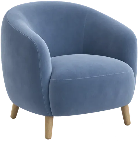
one light, real furniture, the result — not the chemistry
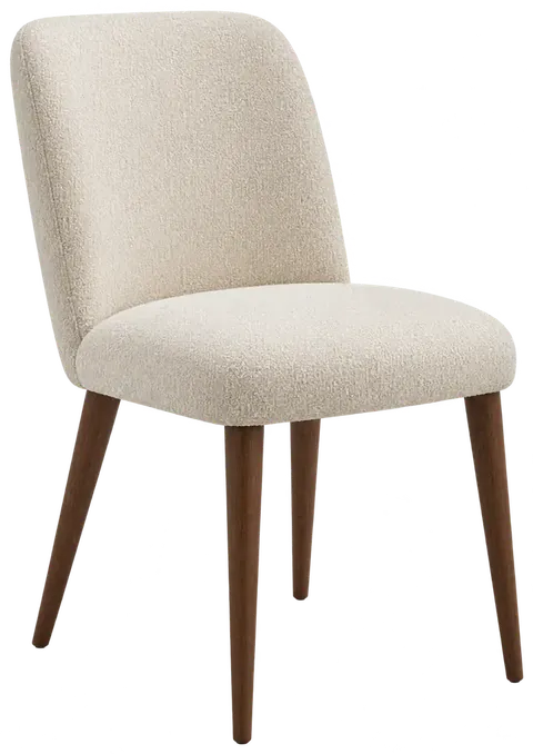
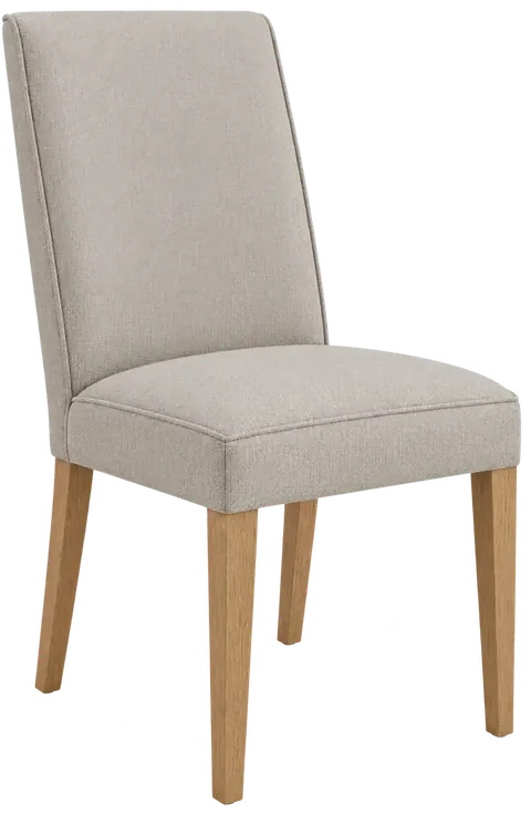
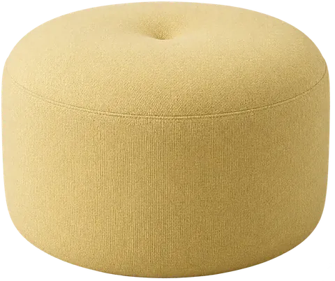
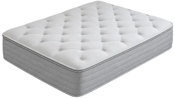
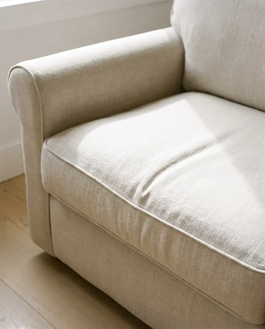
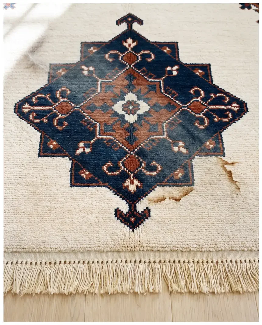
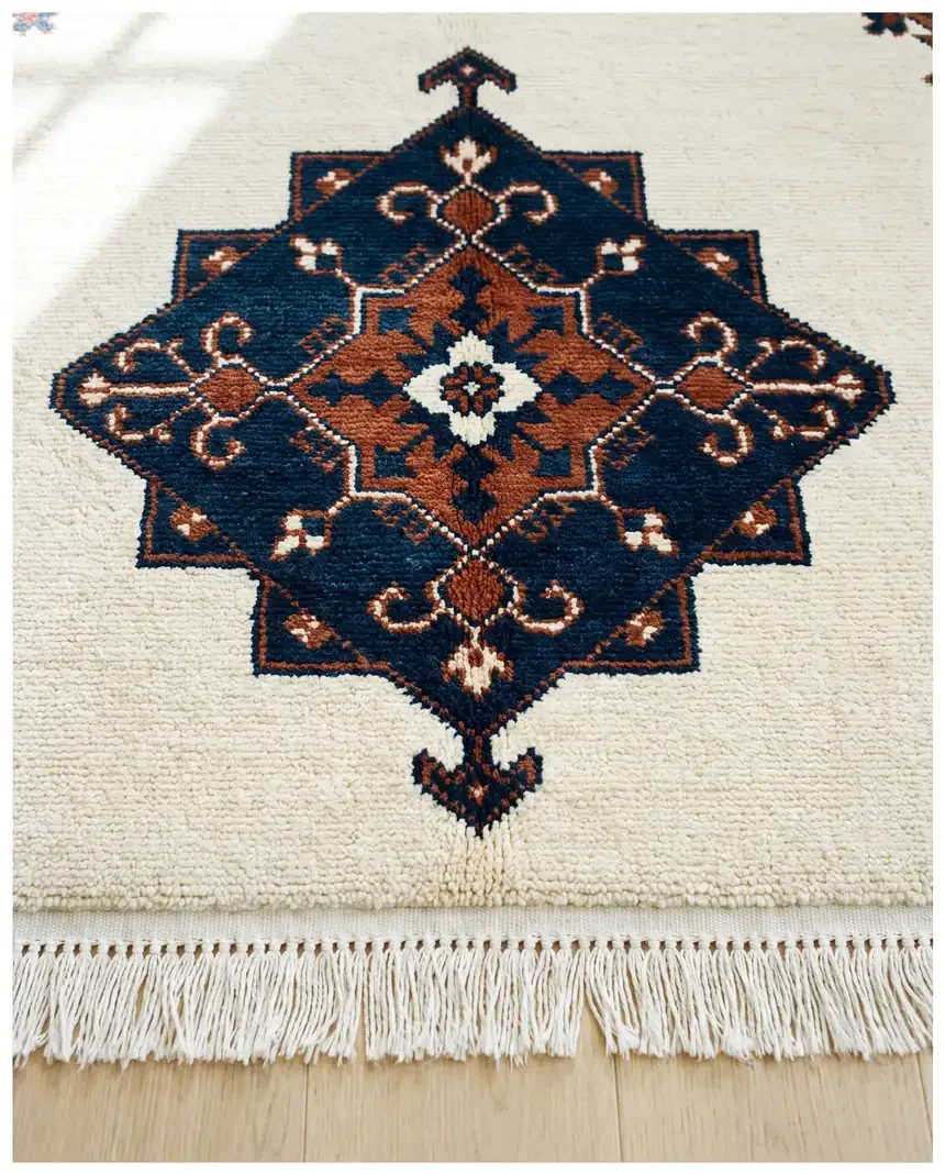
07 imagery. three kinds of pictures, no more. furniture cut-outs from one single studio setup — three-quarter view, soft light from the upper left, the same camera for all nine pieces. calm, sunny interiors in cream, oak and light blue, people only as hands or not at all. and before-and-after of the same piece, same angle, same light: show the real problem — hair, stains, grease — never exaggerate. no faces, no foreign brands, no bubbles-on-blue stock. all images are AI-generated and marked that way in the book; real photos from the first jobs replace them as soon as they exist.
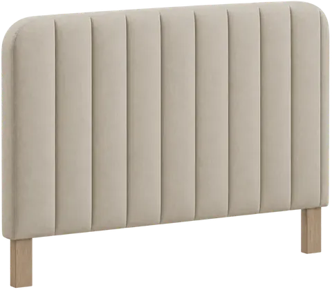
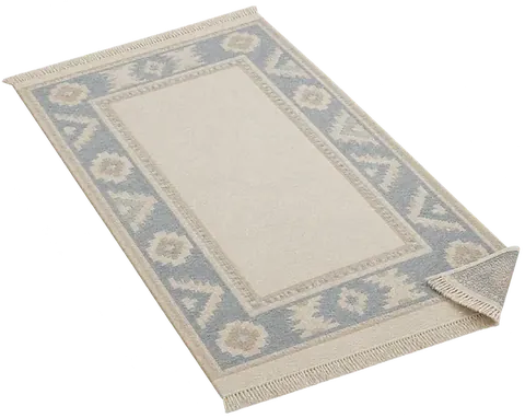
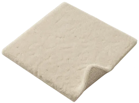
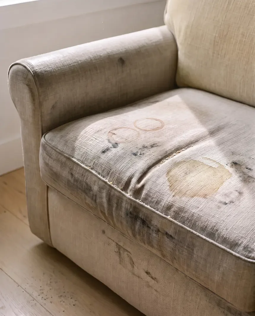
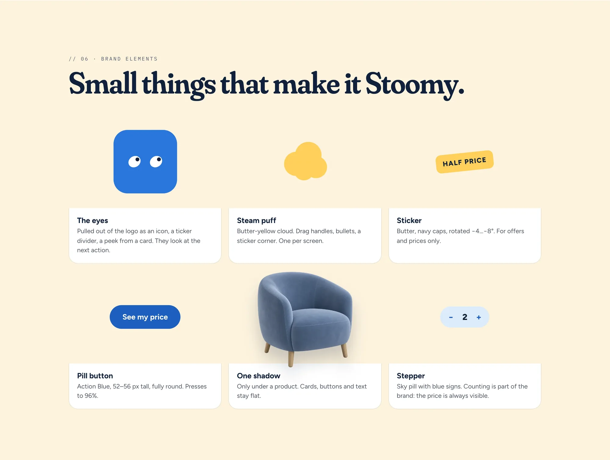
06 elements. the small things you recognise stoomy by: the eyes alone as an icon and as a divider in the ticker — they always look at the next action. the steam puff, one per screen. the sticker in butter, slightly rotated, for prices and offers only. the round button in action blue that shrinks to 96 percent when pressed. one single shadow, and only under a product. and the stepper — counting is part of the brand, the price is always visible.
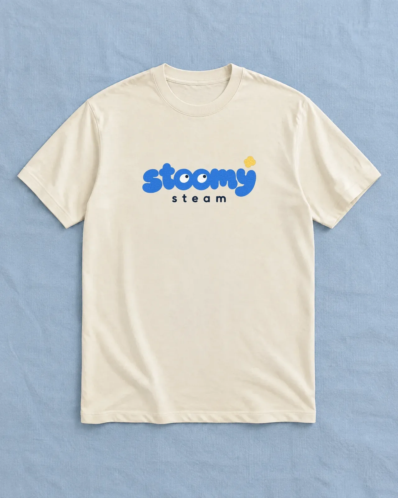
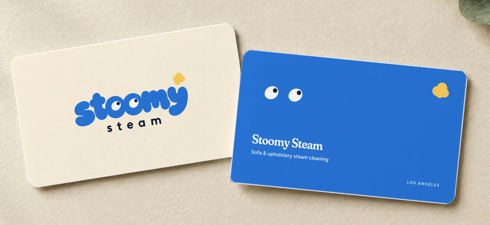
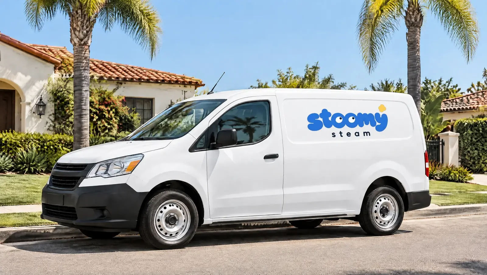
08 applications. on the street, on the crew, in your hand: crew tee in heavyweight cream cotton, screen print in three colours. business cards cream in front, stoomy blue on the back — with eyes. the van with the primary logo centred on the white panel. avatar and app icon from the eyes alone, so stoomy is still someone at 16 pixels.
two brands, two sites — and why the second one needed code

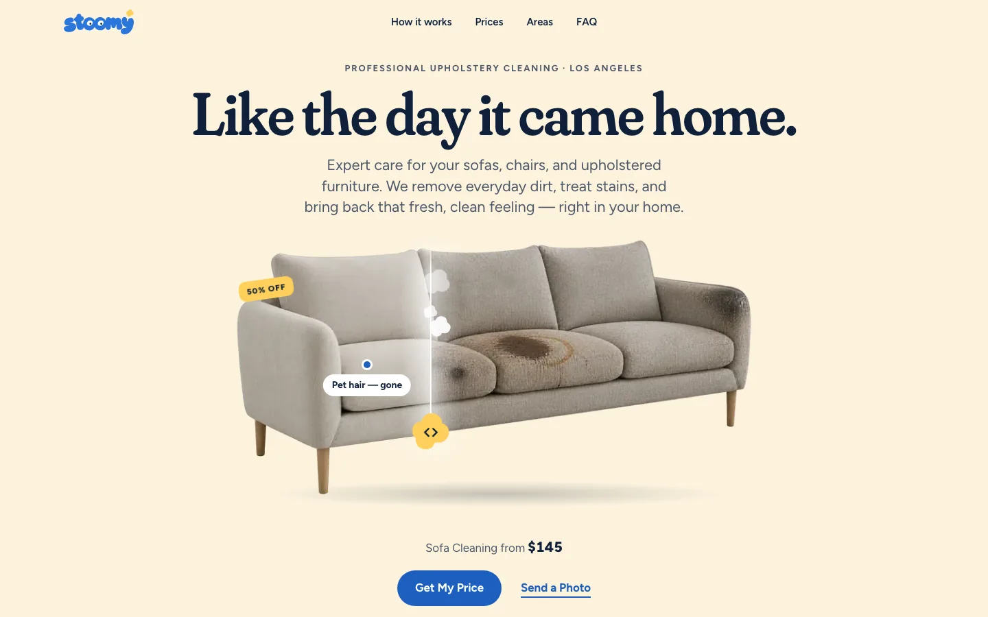
the first site was a builder. for the second i had a reason for code: a character with eyes doesn’t live in a template. in code the pupils follow the cursor — a third of a second behind, softly —, blink every five to seven seconds, each mark on its own clock, and return to centre after 700 milliseconds. on the phone they follow the scroll. on the 404 they look for the page. in the final section they look at the buttons you’re meant to press. if you’ve set reduced motion, you get still eyes.
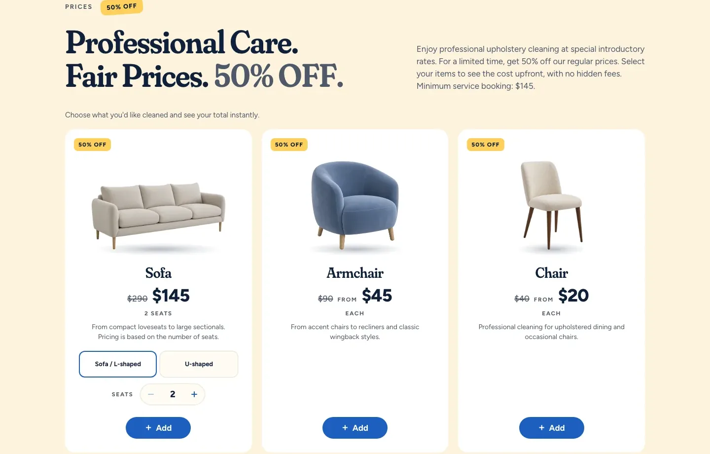
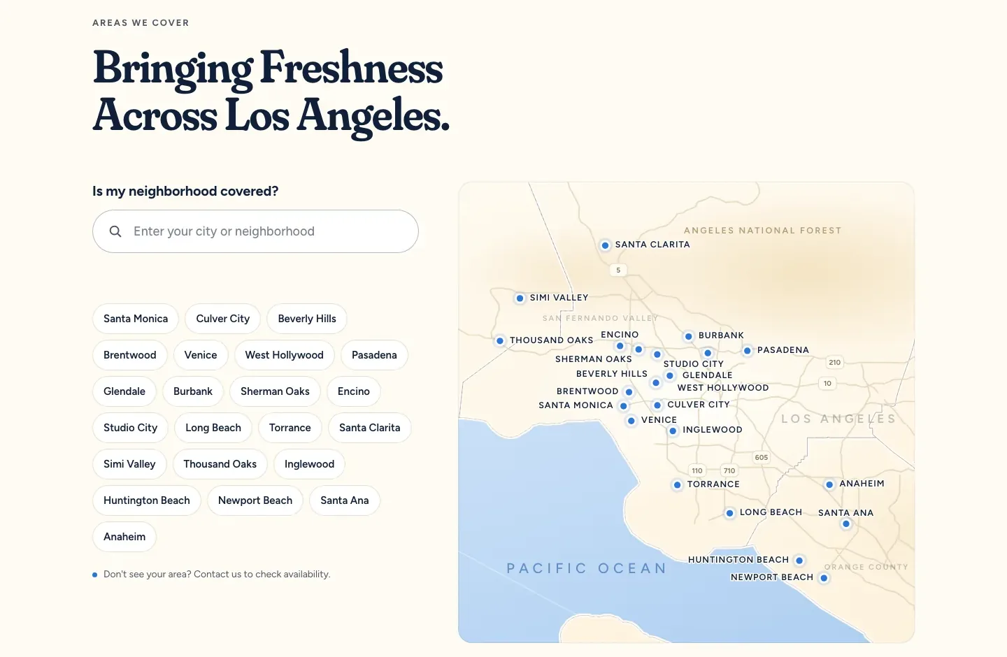
the first screen is a scene: a sofa, half clean. scrolling pulls the steam line across the cushions until it’s all clean — and the eyes in the header follow the line. below it, what site one already got right, now in stoomy’s tone: three promises with eyes as dividers, before-and-after to drag, a price list that works as a basket — plus button, total, ready-made message —, the map with 22 neighborhoods, answers without a click, and a 404 that steam-cleaned itself away. built on 16 september, checked by a second pair of eyes, then handed to the founder for sign-off.
✓ follow the cursor
✓ blink every 5–7 s, each mark on its own
✓ phone: follow the scroll
✓ 404: search
✓ final: look at the buttons
✓ reduced motion: stay still
live since 13 october — and honestly: two days old
version 2.1 is the founder’s sign-off: his spec from 11 october, real contacts, booking straight from the list, readable for search engines and AI assistants, its own domain. on 13 october at 20:18 stoomysteam.com went live; late that evening the first test request ran through cleanly.
what doesn’t exist yet: results. the site is two days old as i write this — no reviews, no numbers, no “first hundred customers”. what does exist: a brand you don’t confuse with the neighbours, a book that protects it, and a site that cleans a sofa while you scroll. the steam does the rest.

just a section to relax — grab the piñata stick and smash all of it
a logo is a picture. a character is someone — and you don’t forget someone.